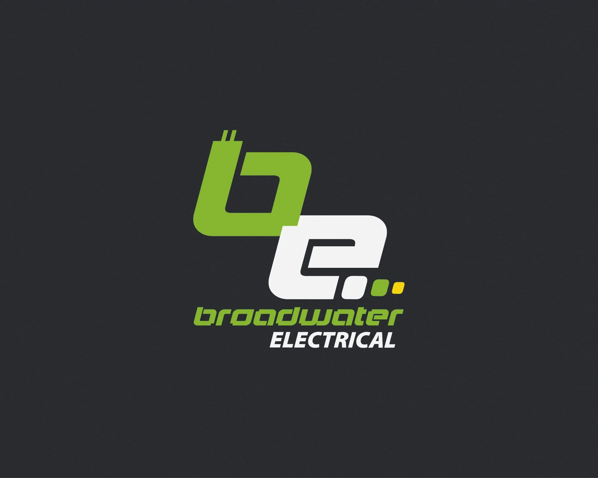
Electrician Branding
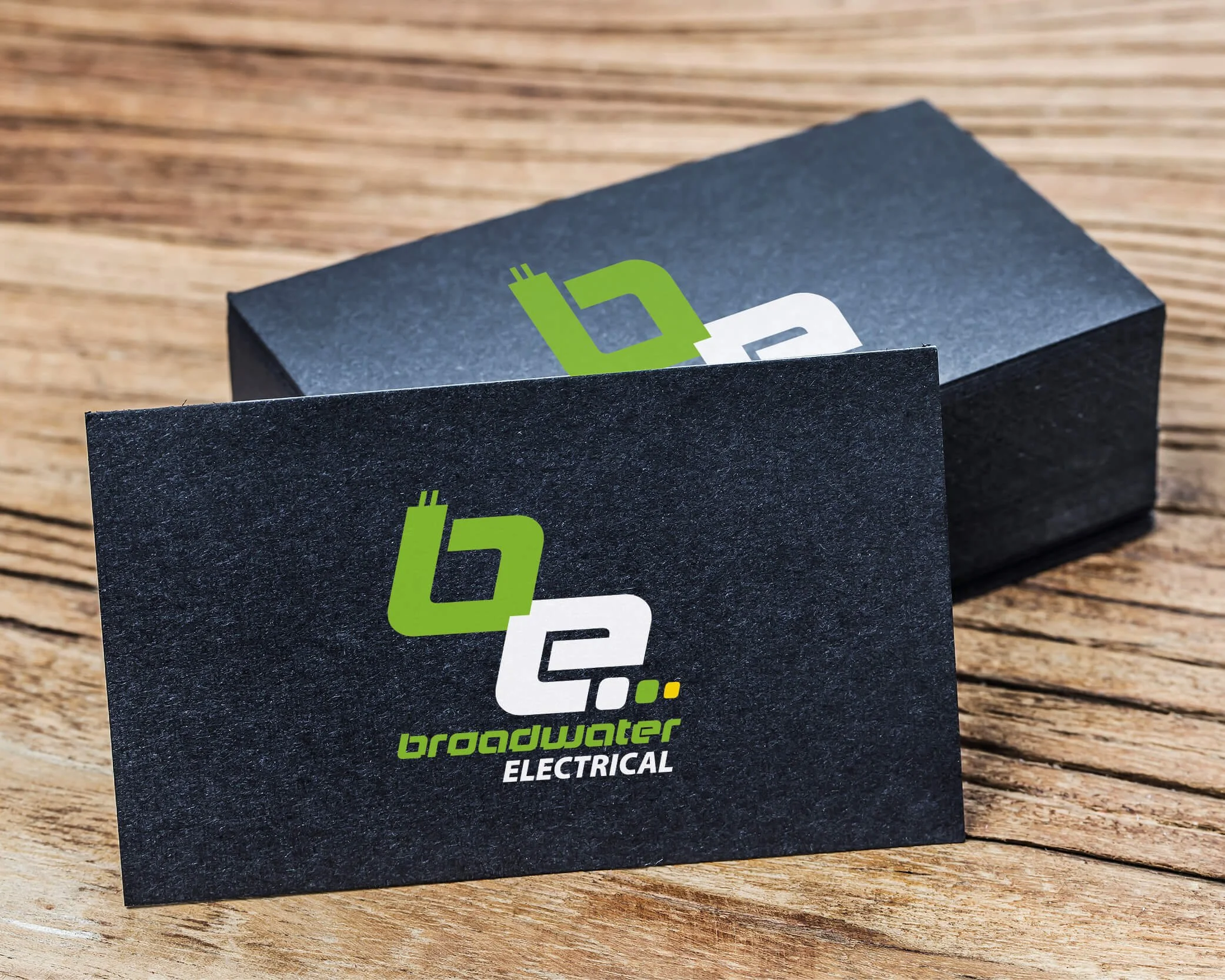
The electrician branding project focused on creating a reliable, professional identity that stands out in a category often defined by generic visuals. The challenge was to balance clear communication with distinctiveness across real-world applications such as vehicles, uniforms, and signage. The strategy centred on a bold, simplified visual system with strong typography and an eye-catching colour palette to convey confidence, clarity, and technical capability. Guided by a principle of clarity first, the identity prioritises legibility, consistency, and scalability, resulting in a functional and recognisable brand that builds trust while maintaining a clean, modern presence. 2010
Brief
Develop a brand identity for an electrician business
Communicate reliability, professionalism, and technical capability
Create a system that works across vehicles, uniforms, signage, and digital platforms
Differentiate from generic trade branding while remaining clear and accessible
Problem
Electrician/trade branding is often generic and visually repetitive
Lack of clear differentiation makes it difficult to build trust at first glance
Visual identities must function across highly visible, real-world applications (e.g. vehicles, uniforms)
The brand needs to balance approachability with technical credibility
Key Tension: Creating a distinctive identity within a saturated category
Strategy
Position the brand as reliable, precise, and professional
Use a bold, simplified visual system for immediate recognition
Prioritise clarity, legibility, and scalability across all touchpoints
Apply restrained colour and strong typography to communicate confidence and trust
Design a flexible identity system that remains consistent across physical and digital environments
Guiding Principle: enhance recognition with real-world application