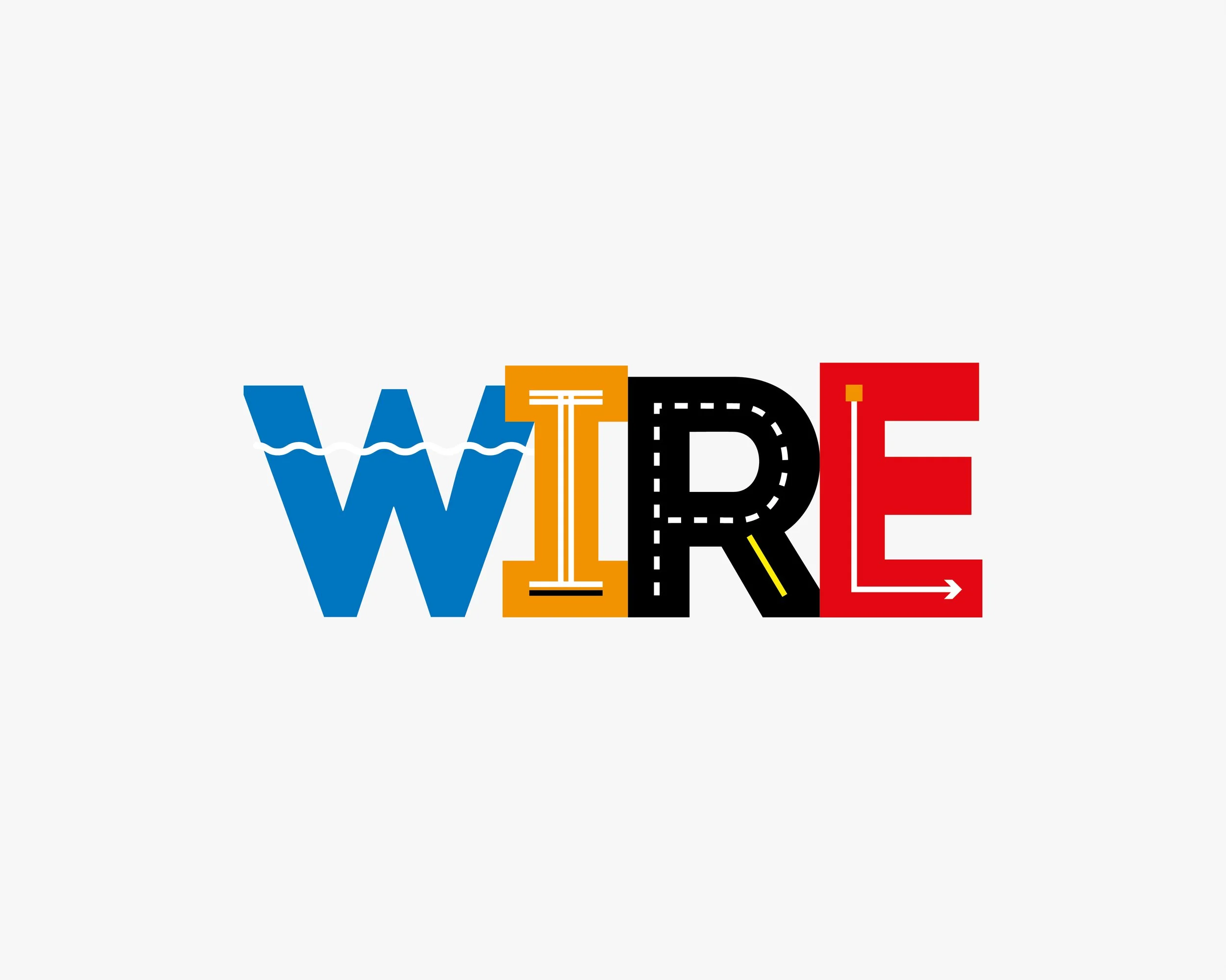
WIRE
The WIRE logo design integrates water, infrastructure, roads, and efficiency through bold letterforms. Waves suggest water systems, structural I beams signal infrastructure, road markings convey transport, and directional arrows express expediting, connection, and forward momentum. 2014
The Brief
Develop a brand identity for a civil infrastructure branch
Communicate technical expertise, reliability, and scale
Differentiate in a category dominated by generic, corporate visuals
The Problem
Industry branding is often indistinguishable, heavy, corporate, and outdated
Messaging tends to focus on capability, not clarity
Visual identity rarely reflects the scale, precision, or systems thinking behind the work
Key tension: How do you create a brand that feels structured and technical, without becoming cold or generic?
The Strategy
Positioning
Precise, capable, and systems-driven
Built on clarity, not complexity
Confident without overstatement
Guiding principle: Reflect the discipline of infrastructure design — structured, intentional, and engineered.